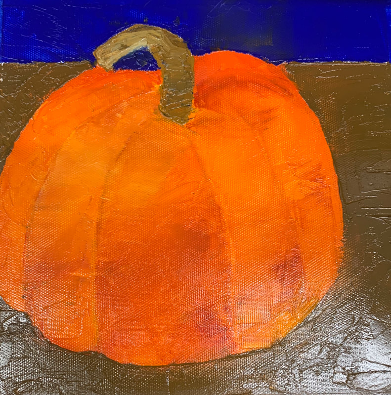
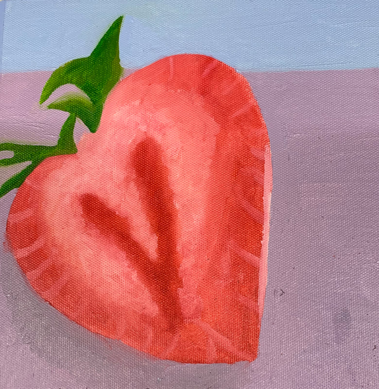
For this mini project, we did one brush oil painting where I picked a strawberry to paint. The other one we used a palette knife where I chose to do a pumpkin. This project was helpful because it showed me how to work with oil paints using two different tools, I am pretty happy with how both of them turned out.
Reference Photo Sketches In Progress Photo Final Painting 1. Describe the craftsmanship of your painting. (Is it neat and well executed?)
I was not very happy with my craftsmanship for this piece. A lot of elements didn't turn out as neat as I wanted them to. For example, the spirals in the hot air balloons turned out really messy and my craftsmanship could've been a lot better there. Same thing for the lines on the ground, they definitely could've been more well executed. 2. How does your work embody the artist’s style? I think my work embodies Hundertwasser's style pretty well by following the same styles that he used. In the same way that he only used one plane, I did the same thing where everything is on one plane and there's not really a background or foreground. In addition, I think I embodied his style well with the spirals in the windows of the building as well as in the hot air balloons. Finally, I think I also embodied his style well by not using any straight lines which is the same thing he did in his work. 3. Describe your choice of colors/color harmonies and how you used them throughout the artwork. I used a monochromatic color scheme for a lot of elements of the pice. For example, on the ground, I used different shades of green to create patterns. In the sky, I used different shades of blue to create a pattern. Finally, in the hot air balloons, I used monochromatic colors for each one to create a spiral effect. I thought that this color scheme would create a look that separated each individual element of the piece and make it pop and I think I accomplished that goal. 4. What is the emphasis (focal point) of your artwork? The emphasis of my piece is the hot air balloons. There are three but they are the main part of the work. Your eye is immediately drawn there because they are bright colors on top of a monochromatic background so you immediately want to look there. 5. How did you use textures and patterns to embellish your artwork? I mainly focused on using different patterns to embellish my work. The border has a pattern, the ground has a pattern, the sky has a pattern, the balloons have a pattern, and so do the windows on the building. I especially liked the stitchwort type pattern in the sky because I think it added to the work to help bring it together. I also like the repeating pattern I did on the ground because I think it was a good embellishment that draws your eye to that part of the piece. 6. How did you put a border on your artwork? How does it enhance the work? The border actually took up a lot more time for me than I wanted it to. I drew out the pattern I wanted then started with the purple color. I then went back and put gold in the middle of the purple parts. Finally, I went back around the corners and around the edges with black because I thought this would really. make the purple and gold pop and I think it did do that. I was very happy with how the border turned out and I think it added a lot to the piece. 7. Describe any difficulties you had creating this artwork. I had a ton of difficult creating the hot air balloon spirals. I couldn't get them to look like I wanted and when I finally figured it out, I couldn't get the lines to look as neat as I wanted. I also had a lot of trouble with the buildings because I couldn't get them into the shape I had envisioned, and I still never quite got them there. Hundertwasser Vs. Klimt Paragraphs Hundertwasser: Hundertwasser was an artist from Austria. He is famous for his architecture and painting. He used vibrant color in his paintings and didn't use straight lines in any of his work. He designed a house in Vienna that is used as low income housing. His work is abstract and all on one plane. He often portrays trees like lollipops, fitting the same spiral theme often seen in his work. Common themes in his work include love of nature, individualism, spirals, etc. Klimt: Klimt shared many of the same elements as Hundertwasser, but his focus was more on the human body as well as nature. He was also a painter from Austria who got his start in architecture and later became famous for his paintings. His work also features many symbolic and abstract elements surrounding the center focus of the painting, often a woman. Compositional Sketches for Final These were the sketches I did for possible ideas to paint for the final painting.
Reference Photo Sketch In Progress Photos Final 1. What watercolor techniques proved to be effective in your painting? How and Why?
I found the salt technique to be very helpful in creating the texture that I wanted on the castle. It worked really well to create the worn effect that I wanted it to show. i also found the gradient technique to be very helpful in showing the perspective of the astle and making it appear more 3D. FInally, I used a lot of layering on the sky and in the water to make it appear more textured and less flat. 2. How important was using transparent layers in your painting? The transparent layers were very important for my painting because I used it them in almost every element of the painting. It allowed me to easily build up the colors in the sky, the water, on the mountains, and in the castle. Without them, the effect I wanted couldn't have been achieved giving a more textured look. 3. Explain how your composition was successful? Did you utilize all the elements of art and principles of design? Explain. I think that for my skill level, I was successful in this project. I like how I was able to create the 3D look to the castle, create layers in the water, sky, and. mountains, and make everything flow together. I think I could've used more techniques in the sky and the water to make them look more realistic, but other than that I think I utilized techniques I had learned well and I think my composition was successful. 4. Was color choice an important factor in the overall success of the painting? Why? I think that color choice was very important here, especially in the sky and in the water. They were both very similar shades of blue but I didn't want them to look the same so color choice was very important in making the two distinguishable. I think the colors I picked factored in to how everything looked at the end and I was pleased with it. 5. Describe your craftsmanship. Overall, I was happy with my craftsmanship. I think I could've spent a little more time doing details on the mountains to make them more realistic because I spent most of my time trying to perfect the castle. I think I also should've spent a little more time trying to perfect the sky and the water because although I worked to make them look different, they still turned out looking pretty similar to each other which I didn't want to happen. 6. If you were able to do something different what would it be and why? If I were to do something different if I did this over again, I would look more at the different sizes and proportions of all the elements of the piece. I. made the castle a bit too large which threw off the spacing and proportions of the other elements in my piece. I think if I made the castle a bit smaller, it would've looked more realistic and like my reference photo. 7. Explain to me what you have learned about watercolor and how it has improved or discouraged your development in art. I have definitely developed and improved since the last time I used watercolor in Art 1. The last time I used watercolor, I wasn't able to get the colors to move like I wanted and often, my paper would ball up and get unusable. I learned new techniques to prevent this and I also learned a bunch of new techniques in general such as salt, transparent layering, etc. that were very helpful in creating my piece. This introduction to watercolors was very helpful because it allowed me to learn different techniques that will be helpful for the final and other watercolor projects. This introduction project was very helpful because it showed me how to create a light to dark range of one color. It also taught me how to use shadows and shading to make a shape look 3D.
In this project, we picked four different color schemes to practice painting with watercolors. I think this was a very good project because it allowed me to see how the different color schemes can change an image, and it also taught me how the watercolors move and how to blend and be able to use the colors like I wanted to.
|
AuthorWrite something about yourself. No need to be fancy, just an overview. Archives
January 2020
Categories |